The Application Observability dashboard provides visibility into the applications and hostnames your network is communicating with. While the Network Observability dashboard focuses on infrastructure-level traffic patterns, the Application Observability dashboard shows you what your users and devices are connecting to — which websites, services, and applications are consuming bandwidth across your DynamicLink network. Access it from Insights > Application Observability. Application Observability dashboard

Date filter

In the upper right, use the date range selector to adjust the time window for all dashboard data (e.g., Last 12 hours, Last 24 hours, Last 7 days).

Traffic filters

Below the tab name, the Filter option lets you narrow the dashboard data by criteria such as locations, IPs, and connections.

Summary cards

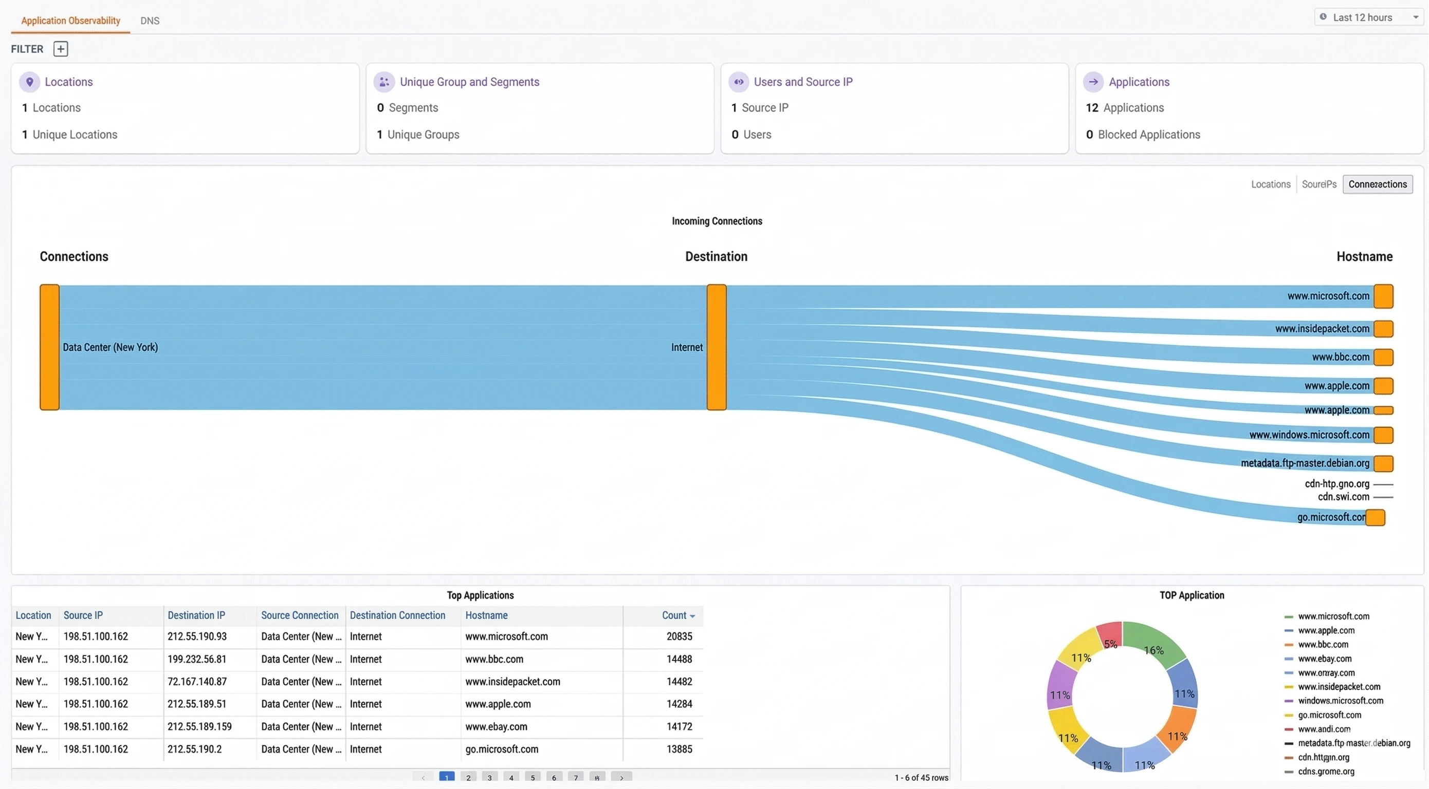
At the top of the dashboard, four summary cards provide a quick snapshot of activity within the selected time window:
CardDescription
LocationsThe number of physical locations generating application traffic
Unique Group and SegmentsThe number of network segments and unique groups observed in the traffic
Users and Source IPThe number of distinct source IP addresses and mapped users
ApplicationsThe total number of applications detected, along with how many are currently blocked

Incoming Connections

The center of the dashboard displays an Incoming Connections flow diagram. This is a Sankey-style visualization that maps the path of traffic from its source through to the destination hostnames.
  • Connections — The named connections originating the traffic (e.g., DIA_pool_1_NY)
  • Destination — The destination category (e.g., Internet)
  • Hostname — The specific hostnames receiving traffic, sized proportionally to their traffic volume
The width of each flow band represents relative traffic volume, making it easy to spot which connections are driving the most traffic and which hostnames are the busiest destinations. You can switch the view using the sub-tabs above the diagram:
Sub-tabDescription
LocationsGroups incoming connections by physical location
Source IPsGroups incoming connections by source IP address
ConnectionsGroups incoming connections by named connection

Top Applications

The bottom of the dashboard is divided into two sections:

Top Applications table

A sortable table listing individual application flows with the following columns:
ColumnDescription
LocationThe physical location where the traffic originated
Source IPThe source IP address initiating the connection
Destination IPThe destination IP address
Source ConnectionThe named source connection (e.g., DIA_pool_1_NY)
Destination ConnectionThe destination connection category (e.g., Internet)
HostnameThe resolved hostname of the destination
CountThe number of connections observed for this flow
The table is sortable by any column. Use it to identify which specific source IPs are generating the most connections to a given hostname, or to trace traffic from a particular location to its destinations.

Top Application chart

A donut chart to the right of the table provides a visual breakdown of the most-visited applications by connection count. Each segment represents a distinct hostname, making it easy to see at a glance which applications dominate your network traffic.

Common use cases

Identifying top bandwidth consumers Use the Incoming Connections flow diagram and the Top Applications table to see which hostnames account for the most traffic. If a non-business-critical application (e.g., streaming media) is consuming a disproportionate share of bandwidth, consider creating a DIA Firewall rule or web filter to manage access. Verifying application access policies After configuring firewall rules or web filters, check the Application Observability dashboard to confirm that blocked applications no longer appear in the traffic data. The Blocked Applications count in the summary cards provides a quick confirmation. Investigating unexpected destinations If you notice traffic flowing to unfamiliar hostnames, use the Top Applications table to identify the source IPs and locations responsible. Cross-reference with the Network Observability dashboard for deeper flow-level analysis, or the Cyber Threats dashboard if the traffic appears suspicious. Understanding per-location application usage Switch to the Locations sub-tab in the Incoming Connections diagram to see application usage patterns by site. This is useful for understanding how different offices or branches use the network and whether location-specific policies are needed.